
360°SaaS Ecosystem
YEAR:
2024 - 2026
CLIENT:
LookFindr (Saudi Arabia Market)
ROLE:
Senior Product Designer (Lead UX/UI)
INDUSTRY:
Beauty Tech - B2B2C Marketplace
EXPERIENCE:
0-to-1 Product Strategy, System Architecture, Design Systems
Reading Time: 6 minutes
Scanning Time: 60 seconds
From Paper to a Digital Ecosystem
About two years ago, I joined LookFindr as the first product hire. At the time, the beauty and wellness industry in Saudi Arabia was experiencing a massive boom, yet internally, salons had been operating for years.
Walking into a typical salon, you’d see the same scene: a receptionist overwhelmed by ringing phones, a counter cluttered with paper diaries, and a business owner struggling to track lost revenue from "no-shows."
There was a massive localization gap; international software felt too "Alien" and complex, while local manual methods were causing businesses to bleed money.

The "Where Do We Start?" Dilemma
As the Lead Product Architect, I inherited a vision that was incredibly broad. The founders wanted everything: a consumer marketplace, a mobile app for staff, and a management system for owners.
This was my first major strategic challenge.
We had the ambition, but we needed a focus.
The internal pull was to build the "shiny" consumer-facing app first. However, through my initial research, I realized that a marketplace is only as good as its inventory. If the salon’s internal management was still a "mess of paper," a booking app would only lead to overbookings and frustrated customers.

I advocated for a "CRM-First" approach. We needed to build the "Brain" (the Web CRM) before we could build the "Face" (the Client App).
The biggest "villain" in our story wasn't the competition; it was complexity. Many salon staff members were not "tech-savvy."
My design philosophy for LookFindr became: "High Power, Low Friction"

All begins with a Digital Front Door
A couple of steps back …
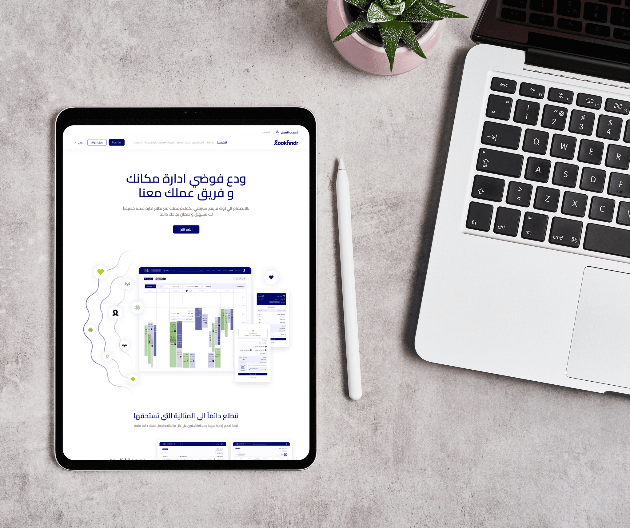
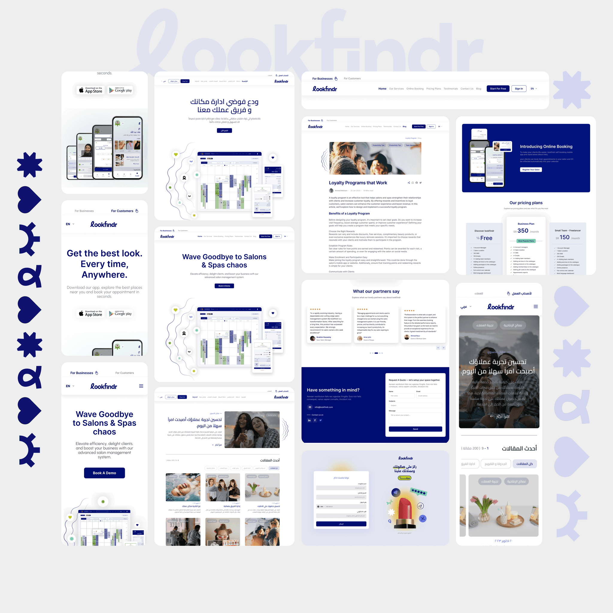
With the "Brain" of the system (the CRM) under development, we needed a way to introduce LookFindr to a market that was still hesitant about digital transformation. The landing page couldn't just be a list of features; it had to be an emotional hook.
I knew that Saudi salon owners weren't just looking for "management," they were looking for peace of mind.
How do we serve two masters?
We had Salon Owners (B2B) looking for professional tools, and End-Users (B2C) looking for a haircut.
So I designed a "Split-Entry" hero section. While the primary mission was B2B acquisition, I ensured the navigation gave a clear, immediate path for "For Businesses" vs. "For Customers."
In a market flooded with generic foreign tools, our "Value-Added" was personalization. It promised the user that the system would naturally support local workflows, Arabic/English support, and ZATCA-compliant e-invoicing.

Designing for Scale
Designing a 0-to-1 ecosystem like LookFindr required a dual-lens approach. I needed to see the Macro (the high-level logic) and the Micro (the individual interactions) simultaneously.
The Strategic Blueprint (IA)
Before a single pixel was placed, I utilized Miro to map the "DNA" of the platform. This wasn't just a sitemap; it was a rigorous Information Architecture (IA) designed to handle the complex data-dependency between the Web CRM (The Brain) and the Client App (The Face). By mapping the user journeys and permission hierarchies early, I ensured that the platform remained scalable and intuitive, even as we added multi-salon management and localized Saudi payment flows.
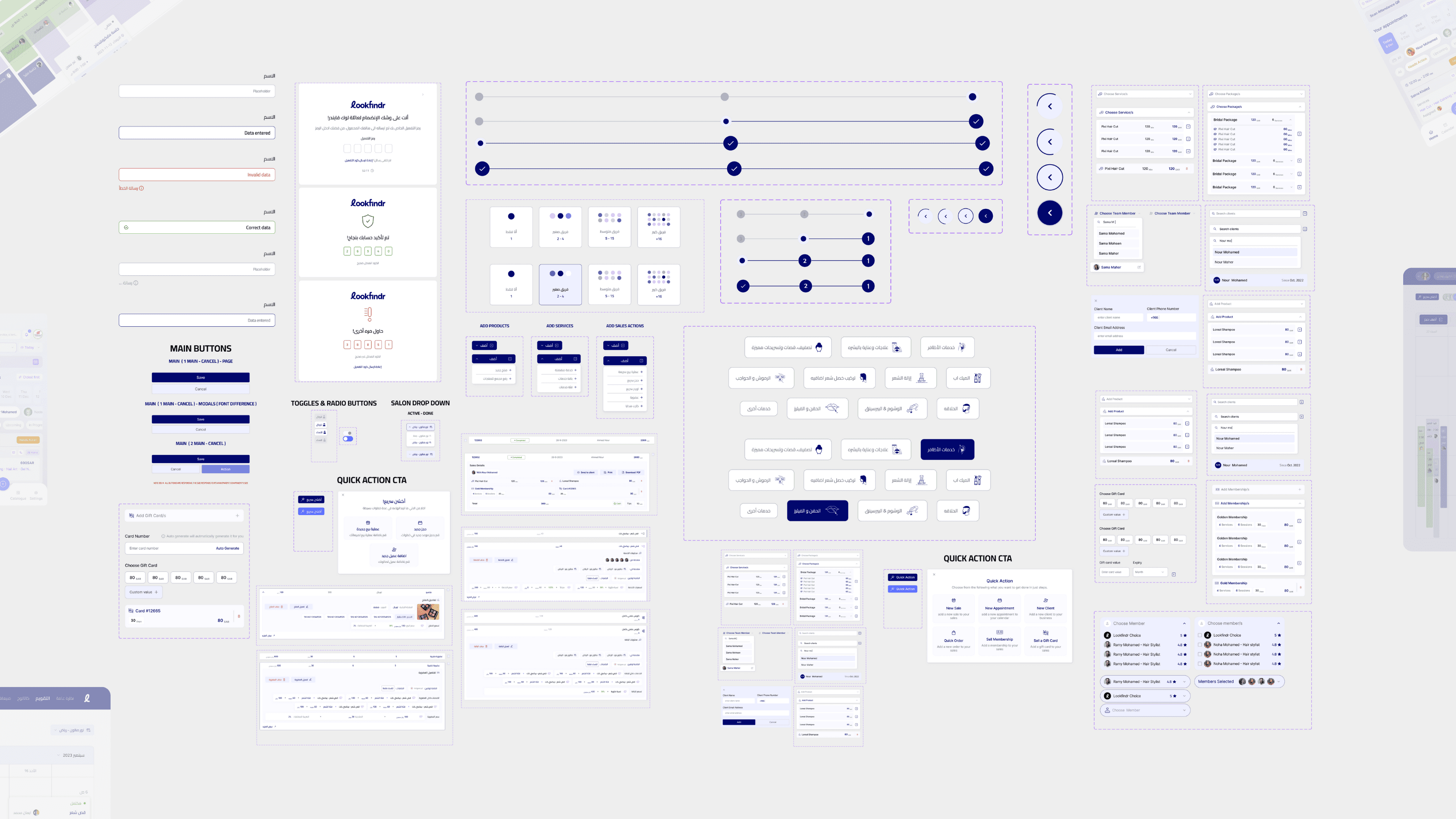
The Building Blocks (Component Library)
Once the logic was solidified, I translated those abstract flows into a tangible Atomic Design System. I built a modular library of "RTL-First" components—buttons, inputs, and modals—that served as the universal language for our engineering team. This synergy between the Miro Blueprint and the Figma Components allowed us to ship high-fidelity features with 100% consistency and zero design debt.

Frictionless Entry
The 30-Second Registration
I designed the initial entry point to be as frictionless as possible. Instead of asking for business details immediately, we focused on the human.
The Strategy: A simple name/email/phone registration, supplemented by Social Sign-on.
The Result: We captured the lead in under 30 seconds. Even if they dropped off later, we now had the contact info to bring them back.
Personalization over Forms
Once the initial lead was captured, I shifted the narrative from "filling out forms" to "tailoring the engine." Instead of a generic setup, I asked for specific business identifiers: Salon Type (e.g., Spa, Hair, Nails), Operational Scale (Freelancer vs. Multi-staff Business), and Digital Presence.
The Logic: This wasn't just data collection; it was a "Trust Exchange." By showing the owner that the CRM was adapting to their specific niche, we built immediate professional credibility.
The Behavioral Play: I utilized a visible Progress Percentage (%) to leverage the Endowment Effect. As users invested more "labor" into personalizing their profile, the psychological cost of abandoning the setup increased.

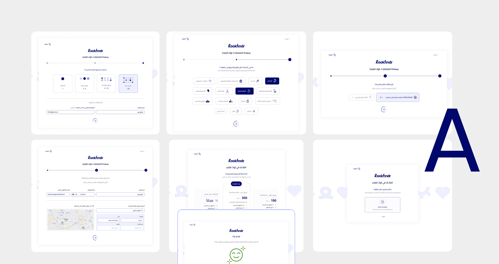
To find the "Sweet Spot" between data depth and user drop-off, I designed and conducted A/B Testing on two distinct onboarding architectures:
Version A: A comprehensive, multi-step flow that gathered granular data upfront.
Version B: A condensed, high-velocity setup focused on Minimum Viable Interactivity. After testing with real salon owners, this version emerged as the clear winner. It was Mature, not just Minimal.
Branching Logic: I architected the flow to be "User-Aware." The system automatically branched based on real-time actions.
By the time the user hit the dashboard, the "Setup" wasn't a separate task—it was already done. The dashboard landed in a "Pre-Configured" state, meaning the user was ready to book their first appointment the second the onboarding ended.
"User testing revealed a 32% higher completion rate for the optimized flow."

Designing for High-Density Operations & Zero Error
The calendar is the heart of any salon. For a receptionist in a busy Riyadh spa, the screen is a source of truth that must be readable in under three seconds while they are multitasking. My challenge was to take a massive amount of data; staff schedules, service statuses, and room availability, and turn it into a "Glanceable" experience.
I developed a visual shorthand where Color and Identity did the heavy lifting. I assigned every appointment a vivid "Status Color" Upcoming, In-Progress, Completed, Canceled, Unpaid) so the state of the entire shop could be understood from five feet away.
By embedding staff avatars directly into the blocks, I removed the need for the user to constantly scan the headers.
To keep the UI clean, I used Hover Logic (Desktop). A detailed "Appointment Bubble" would only appear when needed, showing specific notes and client history, keeping the main view focused on the "Now."
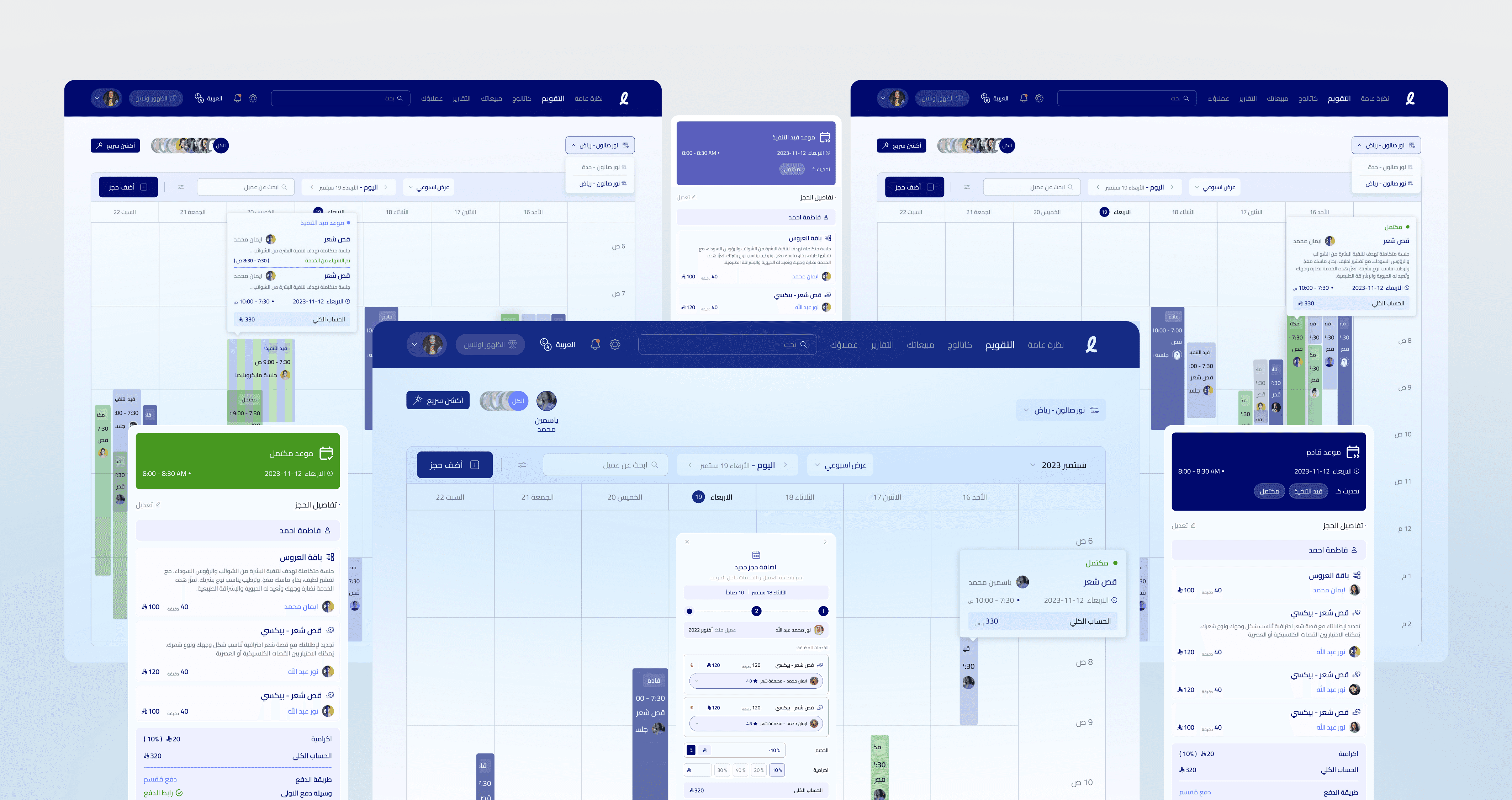
Never Lose Your Place
Because Spatial Awareness is key for high-frequency users. If the receptionist has to leave the calendar to go to a "Sales Screen," they lose their mental map of the salon.
I designed the checkout as a Smart Overlay that stays anchored to the calendar, starting from the appointment overview to the confirmation.
This allowed the receptionist to process a payment while still keeping an eye on the "Next Appointment" waiting in the lobby.

Market research revealed a specific cultural nuance in the Saudi market: clients love to split payments. Whether it’s paying half-cash/half-card, or paying a deposit at the start and the rest at the end, the "one-size-fits-all" payment button was failing our users.
The Split-Payment Wizard. I inherited this "Saudi Attitude" as a primary design constraint. I built a flow that allowed for infinite combinations: Cash + Cash, Link + Cash, or even multiple Payment Links.
To eliminate the need for bulky card machines at the desk, I integrated a QR and WhatsApp Link system. The receptionist could instantly trigger a payment link to the client’s phone. The client scans, pays via their own device (Card/Apple Pay), and the system auto-updates. No manual typing, no errors.

By the end of my two years with LookFindr, the "Brain" we built hadn't just organized calendars—it had transformed the bottom line.
We achieved a 68% reduction in checkout time, allowing receptionists to focus on the next client rather than the calculator.
We eliminated human error in daily financial reporting. What used to take two hours of "reconciling the books" at night now happened instantly.
The localized Split-Payment feature led to a 90% satisfaction rate among customers who finally had a payment system that matched their lifestyle.
While these chapters highlight the most critical user touchpoints, they represent only a fraction of the LookFindr ecosystem. The true challenge wasn’t just designing a calendar or a payment screen; it was architecting a scalable, multi-tenant CRM that handles the complex operational weight of the beauty industry.
testimonial
Ghada brought a level of organizational clarity that was a total game-changer. By defining the product structure from day one, from a whiteboard idea to a market-ready ecosystem with zero design debt.

A MO
Co Founder & CTO

