
Scalable Fish App
YEAR:
2024
CLIENT:
UAE Fish Marketplace ( Dubai & Abu Dhabi )
ROLE:
Lead UX/UI & PD (UX Strategy, UI, DS, Stakeholder Collab)
INDUSTRY:
On-Demand Delivery / E commerce Marketplace
EXPERIENCE:
(iOS & Android) Customer-Facing Experience
Reading Time: 3 Minutes
Scanning Time: 40 Seconds
How it all started
I was brought in to fully reimagine the app, from the UX foundations to the final UI.
Over 40 days, I led a structured redesign process: starting with a detailed consultation and UX audit, moving into IA improvements, wireframes, and iterations with stakeholders, and finally delivering a modern interface.
The result is a cleaner, more scalable shopping experience that simplifies complex ordering flows, highlights product variety, and supports the way users actually shop for fresh fish and more in the UAE market.
The Fresh Fish Dilemma
The app was functional, but it didn't feel reliable for buying fresh fish. it was defeintly failing the "Trust Test." Upon auditing the original architecture, I found that users were confused about the quality of what they were seeing. The UI treated every item exactly the same, whether it was a fresh fish, Ice or a resto meal. I focused on building a system that could handle these details clearly, making sure the design helped people make decisions quickly without feeling overwhelmed by the options.

The Audit: Finding the Trust Gaps.
User Friction:
Category Confusion: Users struggled to distinguish between raw fresh fish, ice products, and restaurant-prepared meals within the interface.
Customization Fatigue: The process for choosing fish cuts, cleaning methods, and weight was purely manual, involving too many steps without any visual guidance.
The "Reset" Frustration: Switching between different stores caused the shopping cart to reset without warning or clear messaging, leading to high abandonment.
Business Challenges:
Revenue Leakage: High cart abandonment rates triggered by unclear store-switching behavior and an over-complicated, multi-step checkout.
Retention Hurdles: Low repeat usage despite the fact that fresh fish and ice are weekly essentials for the target demographic.
Discovery Barriers: Difficulty discovering high-value products, particularly restaurant-prepared meals and specific types of ice.

After the initial consultation and competitive analysis, I focused on understanding real users and the pain points in the existing app. I used interviews, and targeted A/B tests to uncover what was not working and where the biggest opportunities for improvement were before moving into design.


Results: Mapping a Clear Way Forward
Focusing on identifying where users were getting confused, dropping off, or abandoning their carts. This helped reveal major pain points around product discovery, customization, and the store-based ordering logic,
I looked into how users were actually interacting with the marketplace to see where the real friction was. The results of this research did more than just confirm the problem; they helped me see exactly how to solve it. I was able to clear the "noise" and map out a clean path for the rest of the project. This phase turned the research into a roadmap, making it much easier to design a flow that felt focused and intentional.
Friction Analysis
Drop-off Logic: Analyzing why specific flows; like store switching, were causing immediate cart abandonment.
Pattern Validation: Pinpointing which interaction patterns were outdated or cognitively taxing.
Architecture Strategy: Defining how a new Information Architecture could simplify the journey between raw fish, restaurant meals, and essentials.
Business ROI: Prioritizing improvements that would drive the fastest impact on conversion and repeat usage.


The Skeleton: Planning the Logic
Before moving into the final visuals, I mapped out a new layout to make the app as easy to use as possible. I focused on simplifying the navigation so there were fewer steps between finding a product and checking out. I also fixed the logic behind the cart so that users wouldn't lose their progress when switching between different specialized shops. This created a solid foundation that made the whole experience feel much smoother and more reliable.

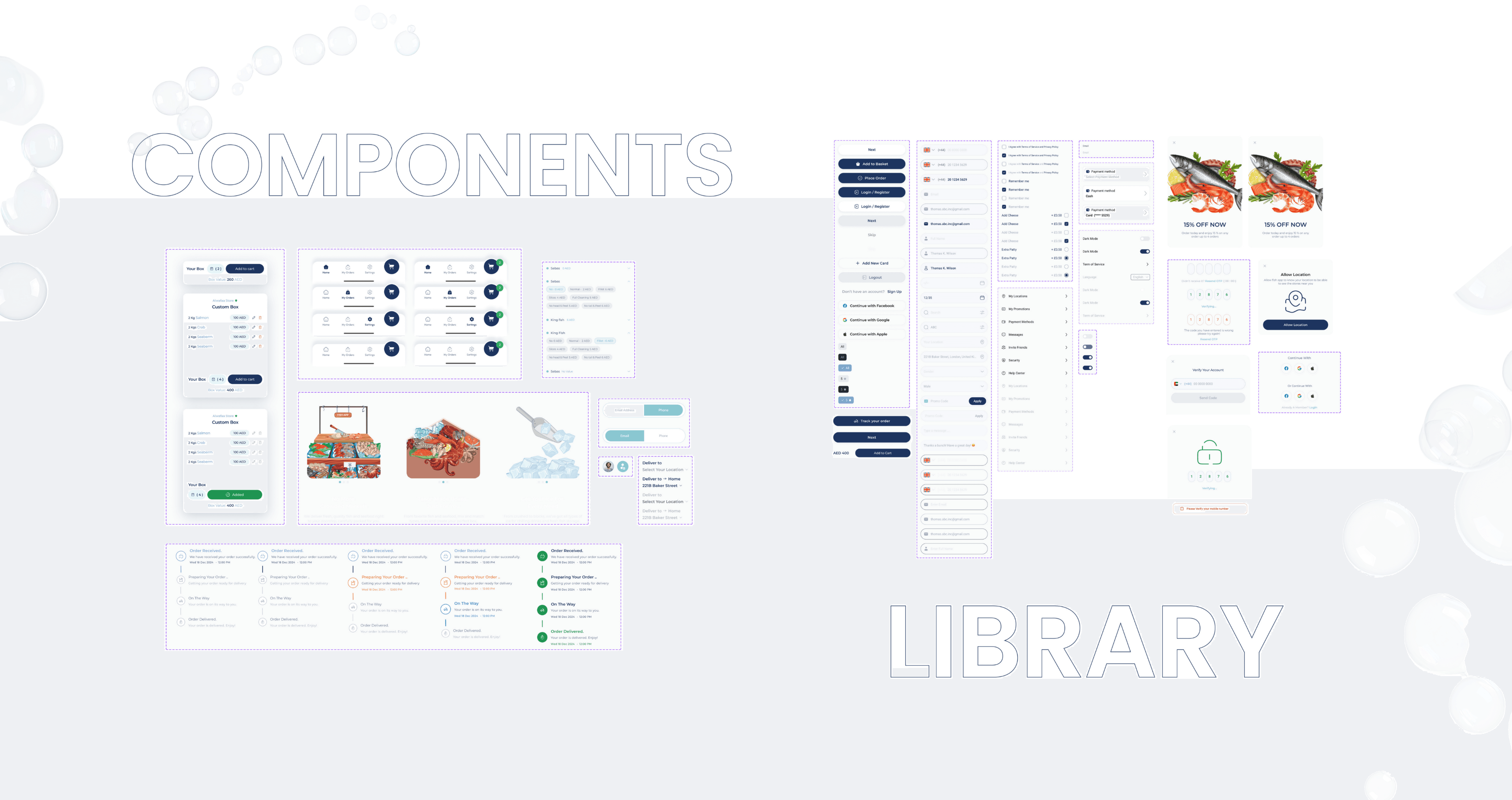
The Categories: Creating Orde.
The core of the product’s architecture rests on a specialized three-pillar taxonomy. I recognized that a standard department list failed the user’s need for immediate clarity regarding the state of the fish. I engineered a visual system that explicitly separated Fresh Catch, Ice, and Restaurants / meals into distinct browsing experiences. By using specialized card layouts and clear trust markers for each state, I made the underlying logic of the market immediately apparent. This reduced the path to purchase by removing the guesswork associated with product freshness and availability.

From Custom Box to Doorstep
Users can build their order from scratch, choosing every detail just like they would at a physical market. Instead of overwhelming them with a long list of options, I created a modular flow where they select their fish, then the specific cut, and finally the cleaning preferences. Using clear, tactile illustrations for every type of preparation, from cuts to cleanings, turned a confusing process into an easy, step-by-step experience. This feature provided a personalized service that made the user feel like they had a direct line to an actual physical fish market.
I designed the "My Orders" section to keep users informed after they buy. Instead of a vague status update, the app shows a live timeline of the order, from the moment the order is confirmed to when it’s being prepared according to their specific cuts. I also made the order history a useful tool where users can see exactly what they ordered before, making it easy to re-order their favorite custom boxes with one tap.
And by focusing on clear logic and user control, I turned a complex marketplace into a simple, reliable tool that people are now actually relying on!
See it live

testimonial.
From the very first consultation, we began to see a clear shift. Fish App started moving toward the strong, well-defined product vision we believed it could become.

Nour Ibrahim
CTO & Product Owner

